Thursday, January 26, 2017

Miss C's room - in Progress

It's been an adventure to reconcile my taste + family budget with what Miss C has asked for for her room. Especially when taking into account more of a long term plan for a room that will inevitably change as Miss C grows.

Taking direction from her singular instruction: "I want a blue room", I took a fairly interpretive approach to decide on a wallpaper and a rug that would be the main pieces and let everything else sort of figure itself out.

The plan was:
1. leave walls white
2. paint ceiling, closet and closer door blue
3. get a rug with blue in it
4. get wallpaper with blue in it
5. use as much of existing furniture as possible
6. throw up lots of art - specifically Miss C's art - on walls

The wallpaper had to have blue in it, but also have other colours to give us flexibility down the road to change things up. So as you can tell, I didn't go all blue and frankly blue is quite a small portion of the overall look. I'm hoping that once the room is more finished it will be enough blue for Miss C and not too much blue for me.
On a rainy day this past fall my mom came over and we put up this wallpaper, all by ourselves. It being our first time hanging wallpaper and all. And I have to say it was much much easier than I expected it to be! Because the wallpaper was only 18" wide and was made out of thick paper it was sturdy easy to shift and match the pattern. The whole thing went off much better than I expected. I was super thrilled with the results. Now I want to #wallpaperallthethings!
So thrilled that I even pushed my tired self to use the remnants in the closet. Everybody says it, but I'll repeat, it's all in the small details. The details that we have to push ourselves to consider and implement when the bulk of the hard work is done and we're just so tired and want it all over. Push through it, says-the-person-who-has-the-hardest-time-doing-it-herself. But honestly, push through it and put in the extra 20 min. The results will wow you. I smile every time I open the closet door.
We have started putting art up on the walls. Little by little collecting pieces that have that colourful-young vibe, things that will hopefully grow with her.

Here's a more recent shot of the room where you can see a bit of the rug. Where you can also see more of the wallpaper wall and where Miss C pushed her bed into the corner (all by herself!). To my complete and utter horror. Joking. But only somewhat.

Today the nightstand is back in it's rightful place in the corner and those frames are centered over the bed once again. Miss C moving things around has been an interesting experience. As much as design is my happy non-mom-non-wife-non-employee place, she's got her own point of view for me to take into account. A point of view that I want to nurture.

Things left to do:
1. I'm pretty sure I'm not going to paint the ceiling blue - terrified of painting it with all that wallpaper up
2. Closet is still not blue
3. Miss C's art collection representation is spotty
4. And the most glaring piece missing are the curtains

I have to say that the wallpaper on one wall feels unfinished. The window draws you in and the wallpaper is somewhat of a very-expensive-and-very-permanent afterthought. I hope curtains and more art will help mitigate this. Fingers crossed. Remains to be seen.

I'm also regretting agreeing to this bed frame. The bed/wallpaper situation could be so much better with a solid headboard. And the flow of the room would be much better if the bed had no footboard. It feels silly to buy a new bed when this one is fine, if not aesthetically perfect. But it is something that is driving me crazy. A lot.
Great thing about the headboard - she's got an awesome place to display her toys. And after all, what's my OCD compared with her joy, right?

Friday, August 5, 2016

Plans for Miss C's room

HERE
I have been trying very very hard to not buy anything for the house before we move in. Other than the sofa and a few practical things that needed replacing, there is nothing new coming into the house with us (and we've selling quite a few things we already have). I am holding my ground and want to live in the house before making decisions. Even if it is killing me right now.

However, as much as I want to keep to this strategy, some things will need to be fast-tracked for practicality. Like I said before, one of the very first spaces that I would like to tackle is Miss C's bedroom. I really want to make sure she settles into the new home well, that she is secure and comfortable. As a sensitive child, I'm worried most about her emotional state during yet-another move. Thankfully, our little boy is much younger and much easier in this regards. So I anticiapte he will handle the move with more ease. (hoping he's not out to prove me wrong).

We already have a bed + a desk. A few weeks ago we came across a desk chair that we both loved at HomeSense. It was around C's birthday and the grandparents jumped on the opportunity to get her something practical. There is also a metal shelving unit in her current bedroom that I'm considering re-using, but I've postponed that decision until we try it in the space.

Miss C, being your regular average 7 year old, has thrown a curveball into my original plan for her room. Now this girly girl, who used to live in twirly dresses, wants blue, wants to wear a baseball cap and shorts. Which is awesome, I love me a sporty girl, but I was so in love with my original ideas that I'm having a bit of a hard time switching gears.

My original plan had stars on a blush pink ceiling, brass curtain rod/rings and white curtains. I was also thinking to spraypaint her bedframe gold :) simple yet opulant, combination of images above and below:
well... she's not having any of it...

For you moms of girls, if you want a pink room, do it while they are little, like really little :) I've gotten some of the pink out of my system via C's current bedroom though...oh and the one before that one too :) so even though the soft blush would have been gorgeous, I think I'm ok with the direction she wants to take.
Sept 2014 - surprisingly livable full on pink room, all four walls
 March 2013 - see what I mean? pink tutu!!! oh... those were the days!
So, yes, blue. Taking a page out of every design book I'm doing everything semi neutral and will bring in blue with the accents only. Just in case she ever changes her mind to... green, black or back to pink :) although... now that I think about it, a pale blue room may be fun for a few years :) after all, it's just paint...

Right now I'm desperately searching for a rug. It needs to be big (8by12) and wool, with a light background and enough blue to get C's ok. Once I've got the rug in place, everything else will come together. I hope.

Wish me luck :)

Thursday, July 14, 2016

Hardware placement, it's important

Anxious people should not reno/build homes. Especially anxious people who are not professionals in construction/design. I fall into the category of these anxious people. Also, into the category of masochists who keeps putting herself out there and into situations that will 100% cause anxiety.

But also, what is life without a little on-the-edge action. I just prefer to take mine in the form of making design choices.

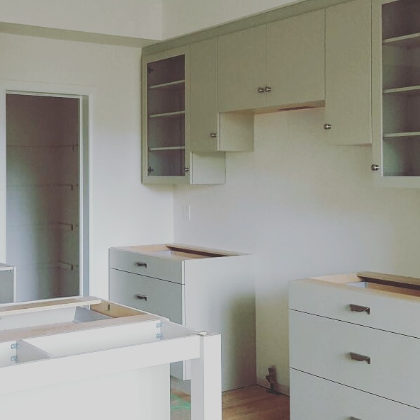
Last time I wrote I was blissfully talking all about kitchen cabinets, today I have a progress photo to share:

When I first saw the kitchen without doors or hardware I was on cloud nine. Honestly, I was ecstatic! Than we went on holidays and the doors were installed and the hardware was on and I started stewing. 

Now, before I take apart the likes and dislikes of the kitchen, I feel it’s important to say the following:

1. In no way, shape or form will the look of the kitchen have impact on the nutritional value of food prepared here. Nor will it have impact on the messes we make, the late night chats we have or the wine we drink. This is the place for memories to happen, regardless of how it looks.
2. Hubs loves things as they are.
3. Now that's I'm writing this and looking at the images for 100th time, I'm actually completely in love and the things that bugged me a day ago are now accentic quirks that I'm finding endearing.

Now that we’ve got the important stuff out of the way, let’s get into the neurotic nitpicking.

I’ve read a few posts about how midway through a reno/install clients/owners begin to panic and second guess the vision. Yep, that’s been me and it’s an unpleasant experience to say the least. After spending a lot of time and money, you hope to be elated, not twitchy. 


That first night after seeing the kitchen I spent hours looking at all the photos I took, judging how I feel about the progress, reassuring myself that this is THE stage for panic, and reminding myself that if my biggest problem in life is kitchen hardware placement, I’ve got it made.


Having said that, things that bugged me on that first night:

1. Drawer pull style. I love them. And I’m not 100% content with them. The way they are installed, they feel small for the drawers. I can’t believe I didn’t think of this, I feel like such an idiot, honestly. BUT… BUT… we didn't want to do narrower drawers and these pulls didn’t come in a larger size. And I still LOVE THEM.


2. Drawer pull placement. So, kitchen design people don’t like it when you install two pulls on one large drawer, it screws with the tracks over time and they can’t guarantee the integrity of mechanisms. So, one pull it was, and I was happy with that because I’m not a fan of two pulls, not matter the size of the drawer. BUT, I should have specified the pull to be placed a little higher on those deep drawers. And I didn’t. ooops! 

3. The knobs… umm… I don’t know if I like their placement either. This is how the kitchen design company installs them standard. I guess I could have asked for them to be placed in the usual manner, closer to the corner, but I’m not sure that would be better.


I think overall things will look much more cohesive once counters, backsplash and appliances are in. Just installing the hood in that top portion of the cabinets will ground things and make much more sense.


4. My last area of discomfort is the sink wall. Just the sheer height of upper cabinets makes it feel… not right in some way. Breaking this up with glass doors would have been pointless, this is not a place for displaying things. This is the workhorse wall of the kitchen to house all the things that need to be hidden. Also, that little bump over the sink… But here, even more than on the range wall, dishwasher, counters and backsplash will make a huge difference.


NOW, lets talk about all the things I do like and I’m glad we went for:

1. Number one, most important thing: I’m super glad that my hubs loves the kitchen, it was his idea to get flat doors and gray colour and I’m very happy to know that he likes how the kitchen turned out. Seeing him happy makes me happy.

2. Those drawers! We have four banks of 36” drawers. Two framing the range and two in the island. I’m a really short person, and the upper cabinets are usually completely useless to me. Being able to have lots of smart storage where I can access it without a step stool was the most important thing for me. Considering we also have that huge pantry, I think my storage/access needs have been met.

3. The quality of craftsmanship is fantastic. For those who’ve been reading for a while, you know I LOVE Ikea. And I would say to anyone that an Ikea kitchen is a great investment. We loved our Ikea kitchen! But it is really nice to have custom sized cabinets, and it doesn’t hurt that the company installing the kitchen is local, everything was made here, in Ottawa, employing people in our community. And the quality is incredible. That makes the kitchen extra special.

4. Built in full depth fridge. Kids are going to love having cold water and ice on demand. I would even say our oldest is looking forward to this more than her new room or the backyard.


5. Have I mentioned how much I love those pulls?? The finish and the little swirly detail are fantastic. I also love that they feel very solid, very well made. Old school style. I love them even more in the ensuite bath! And totally dig their placement.


6. Glass doors were an afterthought. They were in our inspiration kitchen and I wanted them from the start, but worried that the doors would be too huge, being 24”by39”. We were also cautioned against installing glass so close to the range. BUT so far, without having fried so much as an egg on the non-existent range, I can say that they are awesome, I love them, and any inconveniences due to placement will be totally worth it. They MAKE the kitchen, IMHO. I’m glad I pushed for them. 

7. The legs on the island. (1) they extended the island by 3”, never a bad thing. (2) they give the open feel we need because the breakfast nook is super narrow (3) love that we got them the same colour as the rest of the kitchen. Small detail, but love it!


That’s all I’ve got so far. I’ve read every forum discussion on drawer pulls size for 36” drawer cabs, I’m agonized over the photos, I’ve compared photos to our inspiration kitchen and catalogued the differences. I’ve done all this because I’m crazy about these little things. But let’s not lose track of the fact that these things are small (very expensive, but small in the grand scheme of life and family), this is not life altering in any way, and I’m super grateful that I get to have these as my little pet worries.


Counters and sinks next!

Tuesday, June 7, 2016

Kitchen cabinets

HERE
An interesting aspect of our builder’s process is that we had to make our cabinet choices for kitchen and bathrooms practically within a few months of signing the purchase agreement. Down to providing specs for appliances. Needless to say, us being detail oriented design junkies, we relished the process way too much.

We made it through by stressing out our designer and appliance sales guy (both of whom were absolutely wonderful), changing our minds a million times and generally asking them for things they were not used to being asked for.

A lot of the super cool design elements we were unable to get due to them just simply not being practical. I had my heart set on a little spice shelf above the range, like so:
HERE
But had to forgo the idea because kitchen design team couldn’t guarantee that it would stay put. Broke my heart into million pieces. I also considered floating open shelving. But changed my mind in favour of closed everything to keep our clutter hidden. We reworked the layout of the kitchen, reducing the number of cabinets, so there really was no good place for decorative open shelving.

With some of my more design-y ideas out the window I still really wanted to do a standout kitchen that was not like any of the kitchens we've chosen before. Going into this selection process I had no "dream" kitchen I wanted to do, no real idea of where to start. All I knew was I wanted the house to feel practical, interesting, earthy, cozy, neutral.

Hubs on the other hand knew exactly what he didn't want: (1)  no shaker doors, he was vehemently for flat panel cabinets from the start; (2) no white cabinetry. I took his ideas as a starting off point and a challenge, working with what he wanted to get a kitchen I would love.  

With direction from him, my idea was to do flat panel doors that didn’t look too modern/industrial/cold/minimal. I was looking for that sweet spot of balance between cozy and simple, with a bit of edge.
HERE - check out the house tour, it's pretty spectacular
HERE -  love the oak floors in this image, our floors will be very similar (just hoping not quite this orange!).
This kitchen was my inspiration. I love it as much today as I did last fall when we were making our selections. To me, it’s that timeless not-really-in-so-never-out kind of kitchen. This kitchen would have grabbed my attention 5 years ago just as much as it did last fall. It definitely has personality and edge, while checking off hubby’s wants. It feels neutral without being boring, and practical without being utilitarian. With a few accessories, it can definitely go cozy and earthy. I particularly loved the warm putty/gray/green colour of the cabinets and the glass doors. I think the glass really gives the space that live-in quality I want. We didn’t copy this kitchen verbatim, but it was a huge inspiration and a solid jumping off point. 

Two other kitchens images I carried around with me:
HERE - too modern, but love the cabinet colour and the half-up backsplash behind the sink
HERE - a total departure from the cabinet colour, but can't get enough of that lived-in feeling, and the backsplash feels so right
And just a teaser, these are the pulls we chose for our drawers (surprise, nothing like our inspiration images). Now, fingers and toes crossed that we will like the end result!

Friday, June 3, 2016

I don't have a smart post title #1

Me being me, I’ve been putting together mood boards for the new house for months now. No so blog worthy, but definitely functional to consider our options. One item that I’ve known from the start was going to be on our list is a new sofa. But not just any sofa, a dark brown leather sofa with a single seat cushion.
Amber Interiors - blowing up the web this week
I read somewhere that a single cushion sofa is more seating-friendly than when cushions are split up. This idea has sat with me for a while, and when it came time to look for sofas that’s exactly what I wanted. Single cushion.

I also really love the look of warm brown against white walls. So earthy, such a sit-down-put-your-feet-up (not to mention child friendly) choice. 
Lauren Liess - love love love (notice the leather sofa peeking from the bottom left corner)
I’m trying hard for a balance between simplicity and coziness. We still like modern lines, but we’ve moved on from minimalism per se. I’m not sure if I’m explaining it properly, but the best example would be my favourite designer Lauren Liess’ work. It feels like de-stress central and I’m craving that atmosphere for us too.

Less than three months before move in. Yay!

PS. pre-paint great room.

Tuesday, May 17, 2016

Architectural Details - Transom Window

HERE - imagine this + full glass double doors
I tried to add architectural details here and there to make the house unique. Some things needed to be done right away at the building stage (like reworking the kitchen floor plan), other things I knew we could technically do later, but I pushed for upfront. This is the case with a transom window over the den doors. 

Unfortunately I don’t have a picture, but in general terms, we have a den (piano room) that is right off the foyer. The front door has a transom window above it and is full glass, while the den double doors were zero glass and zero transom windows. Making them shorter than the front door, and decidedly gloomier. 

After a lot of back and forth with hubs, we asked the builder to put in double glass doors and a transom window in the den. The rational side of me knows that we could have done this change ourselves, but the emotional side knows even better that we’re at a stage in life where we can’t handle even a little bit of construction. So we caved.
HERE - I love how the door frames line up and use the ceiling height to full advantage
I’m beyond excited about this, as you can imagine. I’m picturing a real piano in natural wood (vs. the semi-electric one we have right now). A huge gallery wall behind the piano. Deep green walls. A bookshelf and one or two comfy chairs for reading. I’m debating painting ceiling the same deep green as the walls. It will be spectacular.
HERE - that dark, warm moss green is calling my name
HERE
And because I can’t actually put this plan in action for a while still, I’m writing about it to feel like I’m making SOME progress at least.

Friday, April 15, 2016

Planing the walk-in closet

I have a pretty good idea of what I want for our walk in closet. I want good storage and a full length mirror, but I also want some drama! I want this space to be a hidden gem, something that makes me smile every morning. Last night I sat down with a glass of wine to give the walk in closet a bit more thought.

There are two reasons why I would like to tackle this project as soon as we move in. In our current townhouse all of our clothes are in a PAX wardrobe which we are leaving here. Aside from the PAX we don’t have any storage furniture for clothes have no plans to purchase furniture for the master bedroom. The plan is to maximize the walk in closet so we don’t need to buy additional furniture for the bedroom. 

I also really want to do this right away because I always feel calmer when my bedroom is organized, even if other spaces in the house take more time to get right. Nothing beats, for me, the feeling of being able to find clothes in the 30 min I have before rushing out the door in the morning. And nothing makes me feel more confident in meetings than wearing a kick ass outfit.

So… organizing the closet is really a priority.
The original layout was a simple rectangle with double doors on one of the longer walls (love!) and shelves with a single hanging rod on the other three sides. Plus a lovely single light bulb in the ceiling. To get the space I picture in my mind, I’ve asked the builder to forgo the shelving on the wall directly opposite the double doors. I’ve also asked to add wiring for another ceiling fixture, centering these on the shorter sides of the space. We’ve asked to remove the light fixtures completely since we would be installing track lighting anyway.

Plan so far is to use Ikea drawer units (either STOLMEN or NORDLI, any suggestions as to which one would be better?) under builder installed single shelf and hanging rod combo on the short walls of the closet. Sorta like here (see my Pinterest board for links):
The second long wall (opposite the double door) will hold a full length mirror (or two). I’ve been eyeing the HOVET mirror from Ikea for years now and think it will be perfect for the walk in closet.

The piece de resistance will be the wallpaper/paint colour. I haven’t talked to hubs yet about this yet, so not sure if he will be on board, but I would LOVE to use a dramatic wallpaper on the two long walls, painting out the remaining two walls + ceiling the same colour as the wallpaper background.

I haven’t finalized what wallpaper to use, real or removable, and what design, but I want it to be bold. The rest of the house will be primarily white and cream, so I want to go all out with bold and dramatic for the closet. Just need to get hubs on board.

So far I’m thinking of something along the lines of:
Could anyone tell me what the wallpaper in the first image is?? I know I’ve seen it around a ton, just drawing a blank right now! A wallpaper I"m considering is:
HERE
I'm not completely in love with it, it's a little too masculine for what I had in mind. But it may be a good compromise to get the dramatic look and get hubs on board.
The small details will fall into place soon enough, for now I feel good about the direction where we're heading with the walk in closet.